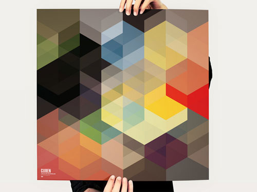
Trying something different with a physical planner in addition to a myriad of digital calendars. The physical one serves as a sort of diary/log that is easy to look back on.
Didn’t think it would be this hard to find “the right one.” But when you are picky it is so hard. In no particular order thoughts on ones I tried so far.
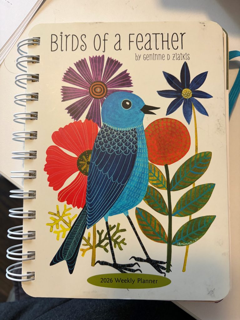
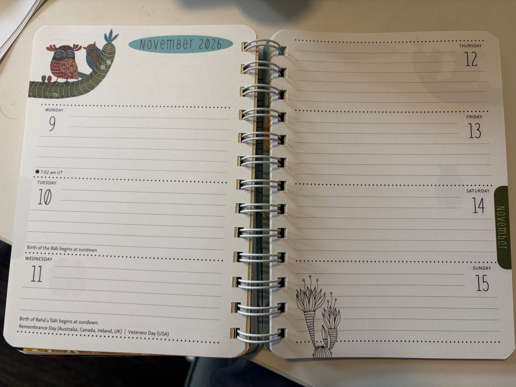
Something I ordered off of Amazon, thought of this idea way into the year so it was slim pickings when I had this idea and before I knew what I was looking for.
Pros:
- Lays Flat
- Dates Filled out for you
- Every day of the week has the same amount of space including weekends
- Drawings of birds are nice
Cons:
- No way to easily mark current week
- Weeks are broken up when they fall on two months
- tons of extra crud including monthly overviews (sometimes in the middle of a week)
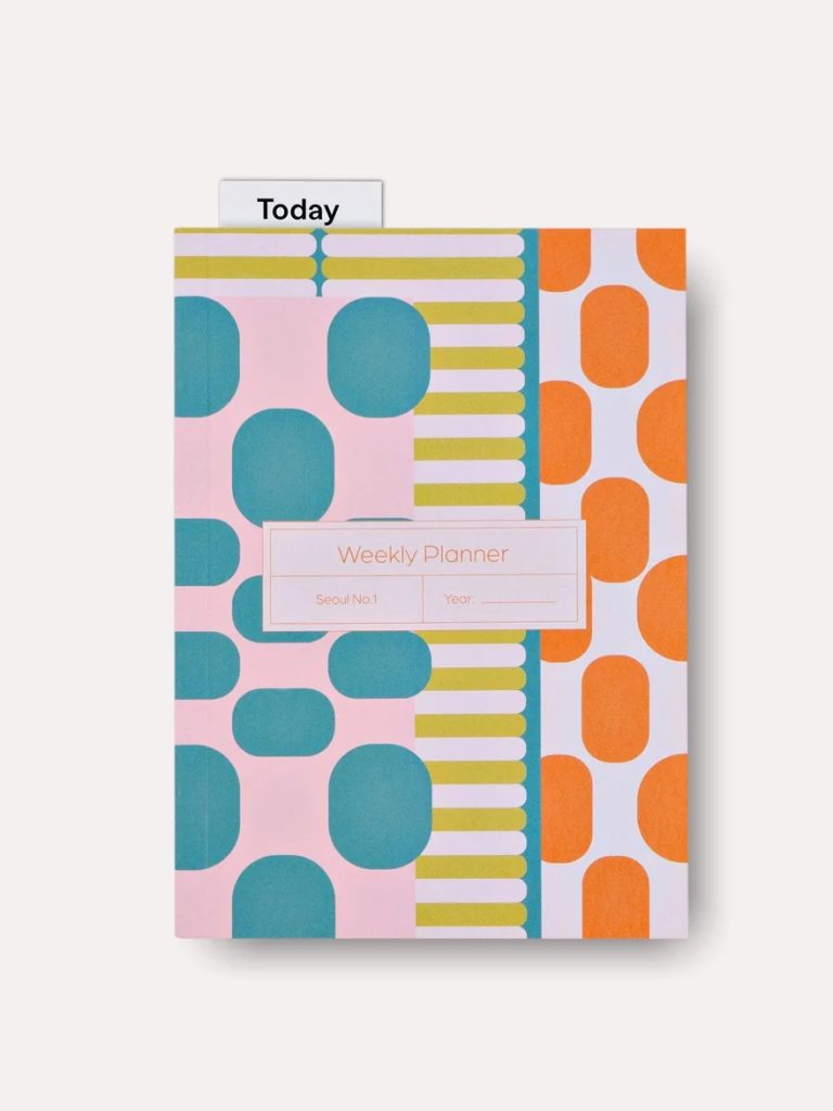
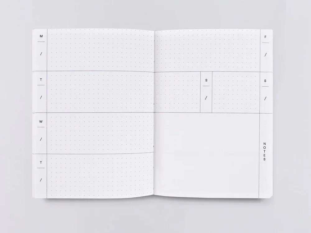
I really thought this was gonna be it. Minimal. Beautiful perfect. … wound up giving it away.
Pros:
- Very Minimal
- comes with a free bookmark
Cons:
- Undated so you have to do a lot of manual work filling out dates.
- Does Not lay flat (huge dealbreaker actually)
- No way to easily mark current week, I guess boookmark does it
- Sat/Sunday small, overall very small
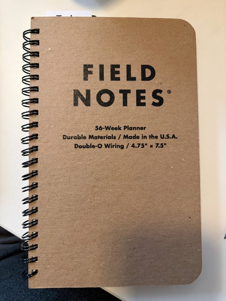
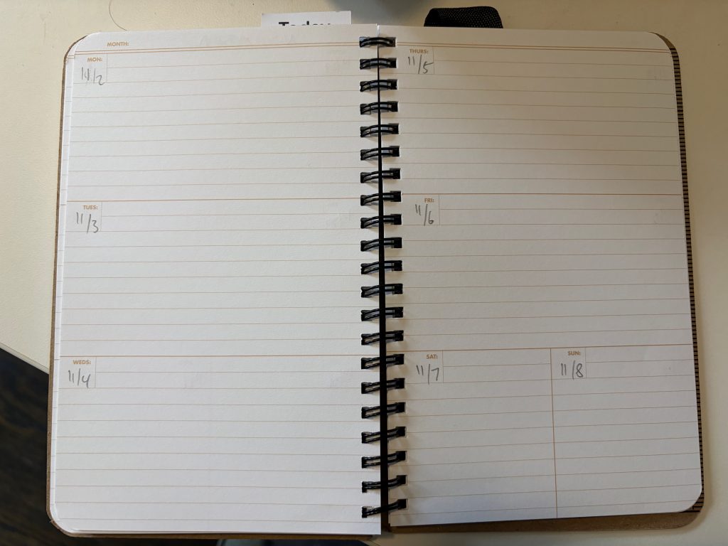
Field Notes make a lay flat weekly planner? I love Field Notes. I’m in! (also not perfect)
Pros:
- Field Notes
- Minimal
- Lays Flat
Cons:
- Also have to fill out all the dates manually (just seems needlessly tedious, but they can sell the same one year after year with no extra work.)
- No way to mark current week easily, even bookmark doesn’t work (falls out), Ive seen calendar with a perforated corner you can tear our, would love this here
- Sat/Sunday have less space, wish they were the same as all other days of the week.