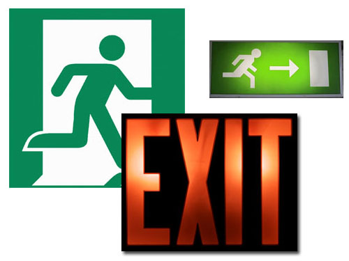
Over at the Slate.com they have an awesome article about design and international signage, in particular a growing “battle” concerning the emergency exit sign and the two prominent and seemingly opposite design strategies (even in something as basic as color). The article is definitely worth a read, especially if you make sure to click through to all of the awesome examples it references.
This article is also part of a larger series on signage, that is also worth a thorough checking out.
