Author: jkordy
Artvertisement [VS]
IMG 00280
Lewis Forever in Residence @ the New Museum
Audience interaction – sometimes it works and sometimes it doesn’t. It is especially hard to pull of, within the context of performance. The lecture/workshop format of this piece broke the ice right away.
I think we knew from the start this was going to be interactive, though the extended waiting for something to happen section in the beginning made for an uncomfortable lack of focus, sitting in the round we had nothing to examine except ourselves. I think more than a few of us were wishing the lights would go down, audience interaction is not usually what you had in mind when you decide to see a performance. This was probably my favorite moment of the whole night.
The rest of the night, my interest came more form the anthropologist in me studying the audience, and trying to figure out what makes Lewis Forever tick, than from any specific art making motives they had. I didn’t feel particularly engaged despite the evening ending with frantic dancing and partaking of “fire water” in an anti-rain dance/ceremony.
[The piece is part of a month long residency at the New Museum, so I’m guessing it evolves over time and repeated viewings yield different experiences.]
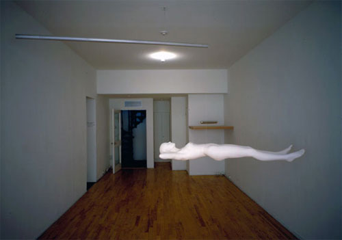
Tom Shannon
Some Books
The Design Coding Rap by the SEO Rapper
Informative and has a good beat.
Dover Beach – Sarah Michelson
A cinematic exercise in distractions from dance? I though the piece was wondrously cinematic. The lighting design and the set and the amazing score came together for something baroque and grand. But I had a hard time focusing on the movement so much of the other stuff was vying for my attention.
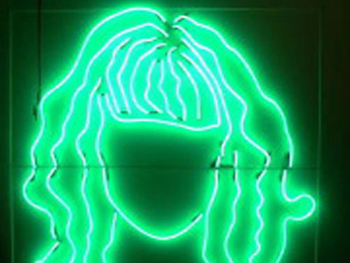
Starting with the giant green neon casting a sickly light on everything, and the lattice work both blocking my view and casting strong shadows so much so that I knew very little of what was happening behind there. What about the X of lights and the center piece of the left half of the stage – a pair of squeaky pin wheels endlessly turning with some par cans attached to them, going round and round and round and round. Was there dancing oh yes, but I was admiring the whole and not focusing on the movement in particular.
A horse-head clad dancer appeared and disappeared and sent some laughter through the audience. The lighting kept shifting and the sound kept morphing from lyrical to pure noise even to moments that made the walls shake, a lot of the score created by live musicians within the space.
Eventually Sarah’s trademark make the audience annoyed/uncomfortable lights came on, this time from behind, and a few moments later silence ensued. I could finally focus on the dance. I found Michelson’s movement vocabulary exciting to watch, and was thrilled to be able to finally focus on it so clearly, though the silence and harsh lighting made more than one audience member squirm a little in their seats. Eventually the score and the more normal lighting returned and the cinematic grand qualities took over again.
The piece ended with another element I would call a Michelson trademark, the is this over, or will there be a second act after more than half of the audience manages to leave? Oh, and is that unattended running smart car parked outside part of the piece? no, not this time. I don’t think.
This piece seemed less experimental, more polished, formal and grand. It didn’t feel immediate to me but fully finished and presentational. So much so that I am afraid it might be mistaken by some people as high art pretentiousness instead of the genuine inquiry and experimentation that it is.
Quote
Art is art. Everything else is everything else.
– Ad Reinhardt
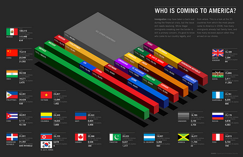
Infographic Pr0n
So many infographics are terrible, wasteful of your time, and often acheive the opposite of their intended effect. So, I was pleasantly surprised to come across a collection of very excellent ones. This flickr set is from the good magazine archives. Check it out for examples of infographics done right.
