Tintin

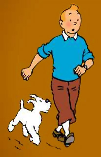
I almost forgot, Today, January 10th is Tintin’s Birthday! Happy Birthday TINTIN!

I love Tintin. Of course anybody who loves him has to be a little conflicted. I think acknowledging the not so positive parts and celebrating the rest, which are so great, is the best path.

I also heard more chatter that a movie might finally get made. Can’t wait for a movie version.

The Shipment

theshipment
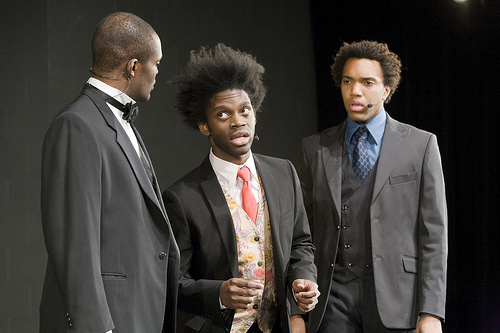
Attention White People* you must see this show!
It will make you uncomfortable. There are token white people in it and Young Jean Lee secretly hates you. In fact all minorities secretly hate white people. You may think you are a special white person, who is immune to issues of race, you don’t see color. Well you will if you go see this show and you will also be uncomfortable. A little minstrel? Maybe some incest or fecal jokes will make you cringe, then. No? How about being called out on your color-blindness?

If you happen to not be white, you should also go, you will get a good laugh! Lee is simply one of the most brilliant people in this field to deal with race, and although the show seems a little unbalanced and composed of two distinct halves, in the end, hopefully you will all have learned something about yourselves and how you react when confronted with race issues head on.

* I am one. If you need help figuring out if you are one this might help.
The Kitchen
New York, NY
January 8-24, 2009.
more even more

Tumbarumba

Here’s an interesting art project from turbulence.org:

tumbarumba

Tumbarumba is an add-on for Firefox web browsers. It quietly sits in the background, occasionally inserts a fragment of a story into a webpage that is being viewed. The result is an absurd sentence that is reminiscent of the surrealist exquisite corpse game. If the inserted fragment (we call the fragments “tumbarumbas”) is spotted and clicked upon, the entire story will emerge and eventually take over the page.”

I love projects that deal with disrupting and exposing the workings of the internet (see Mark Napier‘s Shredder or Riot projects), and I think this one is a great idea. I’m just not sure if this one is very successful. I think the digital interruption work is really great, but I think the content and the context are at odds with each other and it’s hard to relate the two.

You can get it from turbulence here.
Tumbarumba was made by Ethan Ham and Benjamin Rosenbaum.
A commission of New Radio and Performing Arts, Inc. 2008

New Blog Find

supersmart supercreative entity by the name of zefrank has started a new blog STOP it aint pretty but it sure is chock full of great advice from someone who knows what they are talking about when it comes to the digital community space STOP if you are in charge of an online “community” you should check it out for great advice STOP

Attention to Detail

I came across this article, and it made me think. In the image above the dotted line is the old MoMA logo and the solid line represents a new design. If you set the two designs side by side someone could “stare for some time before detecting the slightest distinction.” The cost for these tiny changes was in the “low five figures.”

First things first, this is not a typography rant, I am a typography noob, in the above image I have no idea what font that is, and if I was looking at the two designs, I too would probably have a hard time seeing the difference. However, I love the idea that MoMA would spend a lot of time and effort to figure something out that at first glance would seem trivial. I love the idea of people paying attention to details, little tiny, seemingly insignificant, the things other people miss, details.

Designers and artists (usually) understand the importance of details. A line off by a millimeter, a speck of dust, a smudge, something off-center by hair, all of these things make a huge difference. Creative types obsess over these things, I am one, and I understand this need intuitively.

But I am also conflicted. I’m sure a lot of people would read this article and think that is a lot of money to just adjust some lines! Are they just being super anal? Is this a huge waste of resources? Can spending money just to make something beautiful be justified? Shouldn’t you put in something ugly and cheaper, or not re-design something that looks just fine and put the difference towards charity? This is the same argument that plagues art in general: We should cut spending on the arts (what a waste!), and use it for important things.

Well, whatever happened to “God is in the details”? Little things matter and make a difference. It’s hard to quantify the impact of a more legible, less ugly font, or to quantify the inspiration that a particularly great work of art brings. The marketing department will have a hard time figuring out the ROI, but a more beautiful logo can make the brand more memorable, more familiar, and an inspiring work of art can help boost morale or productivity. And it all starts with the details, they really matter. And us creative types, will have to keep fighting, to make them important and to bring attention to them, because, inherently, we know how important the details are.

Quote

Errors should be easy to detect, they should have minimal consequences, and, if possible, their effects should be reversible.

— Donald A. Norman

(speaking on how things should be designed)

The Legend of Leigh Bowery

This is a really great documentary about a fantastic artist whom few have heard of, even I was not very aware of the great, crazy, and even sometimes disgusting things he has done.  But I always admire anyone who lives their whole lives as a performance.  Leigh really understood what it means to perform.  Not some light, vanilla acting but real hardcore performance, the kind that transforms you inside and out.

The Legend of Leigh Bowery
Director: Charles Atlas
2001
more but really you should
just watch the film

The Design of Everyday Things

I am somewhat surprised that this book has so much traction in 2008. The design corners of the internet are always raving about this book. How can a book that was written more than 20 years ago, and refrences film and slide projectors as the high tech presentation tool of it’s day be so relevant and so often quoted in the age of the internet? Let’s not forget the interenet is the land of things that usually have negative half-lives, and are tired and over, before they even come to existance.

Well the sad fact is that we, our society, has learned very little about designing things in the past 20 years. Actually, it’s more apt to say, we’ve learned a great deal, but we still have a great long way to go to actually implement what we now know, and have know for some time (i.e. this book).

Everyday things are still being designed and manufactured very very badly. The biggest conundrum is why we as a society stand for it? Why are we taking it lying down? Why do we continually accept things that in their design are hindering us, wasting our time, and even in many cases endangering our lives? Norman touches on this in his book, partly it’s because we all understand the need to occasionally cut corners to save time or cost, but partly it’s our own psychology, when bad design happens to us and causes us to make mistakes we always seem to blame ourselves.

Well no more! I think the main reason the book is so revered is that it is a manifesto of sorts, it ends with a call to action. You! Consumers! Stop buying crap! Put your money into well designed, thought out objects that don’t suck! If we all did that our world would be that much better.